How to Make Comics
Part 4 - Digital Inking:
This is the fourth part of the tutorials I've been writing about how I make comics. If you haven't already read the last part, Roughs to Pencils, feel free to go back and read that section now.
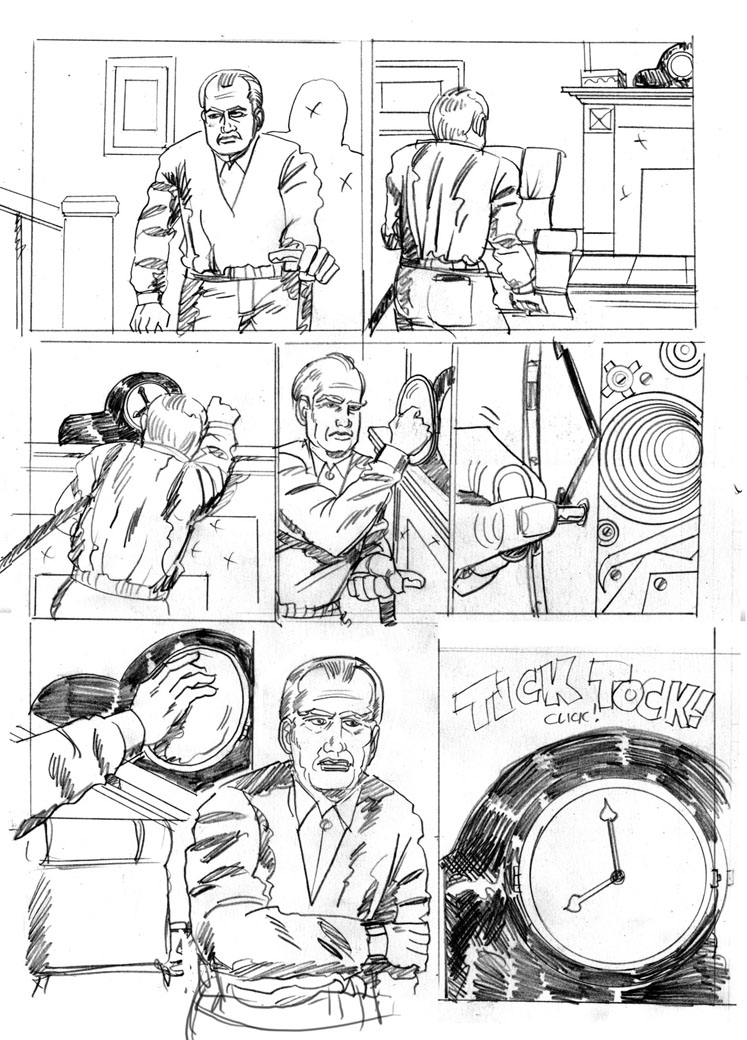
Here're my final pencils for my second page, just to give you a starting point:
(Click on the small image to see a larger version in a new window)

As you might remember, the last tutorial left us with a finished pencil drawing on a 11 X 17" sheet of bristol drawing board, so the next step is to scan the image back into the digital realm, so we can ink it.
Scan your artwork
It's really difficult and frequently expensive to find a scanner that can handle such a large size, but you can use my technique to scan it in on a standard 8 1/2 X 14" scanner. What you want to do is rotate it sideways and scan it in in two scans, making sure the top and bottom halves have some margin of overlap. In Photoshop, orient the two scans so that up is up. Then change the top half "Canvas size" to double the current vertical size, leaving the initial scan at the top of the document, making the document roughly 11 X 17. Then drag the bottom half document into the top half document, setting the new layer's transfer mode to "Multiply". This makes the white part of the image transparent, so we can align the two pieces.
Reposition the bottom layer so that it overlaps and lines up with the top layer. If you scanned it in straight, you won't need to rotate the second layer, but merely align it to the first. If you need fine precision, change the layer's transfer mode to "difference", and when things are aligned, the image will show as totally black.
Once you have things lined up, turn the layer's transfer mode back to normal, select and delete any unneeded overlap, and merge the two layers using layer:flatten (or the keystroke equivalent, "Command-e"). Adjust the document size to the document size is trimmed to the correct 11 X 17" size. Save the merged document.
Why digital ink?
Now, if you wanted to, you could print out this scan onto a clean piece of 11 X 17 bristol board (say, in a non-reproducing blue ink), and ink it traditionally, using pen, or brush, and ink. Me, I'm clumsy, and like to take a digital approach. If I were to try to use traditional methods, I'd knock over the bottle of ink, drag my hand across the page, and generally mess up the artwork. When some folks go digital with their inks, they might use programs like Photoshop or Corel Painter to ink the page, but I like to use a strange program called Manga Studio.
Why do I like it so much? I love the inks. Thee program includes some elaborate tools for laying out pages, making panels, setting type, and applying tones, but I just love the inks. They just "feel right" to me. The line looks right as I drag it across the age, and when I lift of at the end of a line, it just looks natural. Eh! To each his or her own. There's a simplified version available for around $40 (on sale), so give it a try.
How to Ink.

Let me be the first to tell you, this section actually has very little to say when it comes to telling you how to ink a page. I've spent quite a bit of time preparing the artwork, and talking about the why of digital inking, but it's very hard to tell someone how to ink. It's kinda like telling them how to draw. It's a learned skill, and I'm still busy learning it.
Let's get back to the why. Why do you ink artwork? In the old days, artwork was inked because pencils were too faint to accurately print, because of the primitive technologies. Nowadays you can take tight pencils, and print directly from them, but there's actually another reason for inking a comic book page. It's all part of the refining process that constantly goes on in the creation of a comic. You're always tweaking the writing, the pacing, and the artwork, and this is another chance to improve the final product, and make it look much more finished, and to make it read better. You're also reinforcing things like light direction and shading by establishing pools of black, and transitions between light and dark, and by varying the line weights.
The process
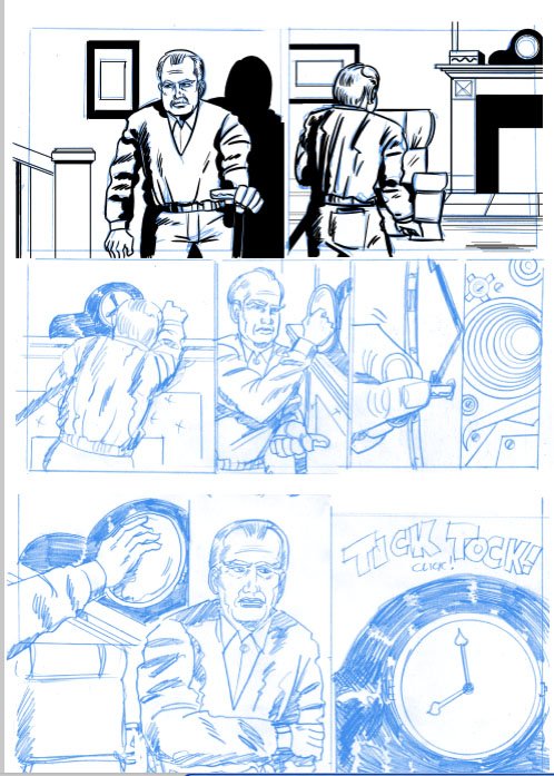
Whichever program you use, the process is much the same. You put your pencil artwork on one level (frequently turing it a light blue so you can see what you're inking), and establish an ink layer above it. Using a pressure-sensitive pen and tablet (Wacom is the industry-standard), you want redraw the artwork in black, using the original artwork as a guide, but being sure to keep your lines "alive." The last thing you want to do is just trace the original drawing. This will kill all the life in the drawing.
Now's the time to fix the little imperfections in the art; the bad anatomy, the sloppy pencils, the eyes going off in different directions, the hesitant depictions of folds of cloth, as well as the hard rigidity of inorganic forms. Establish (or reinforce) your light sources; pour out the ink onto the page and carve your drawings out of the stygian blackness.
Whew!
When you're done, turn off the bottom reference image and revel in your beautiful, finished inks.
