How to Make Comics
Part 5 - Digital layout in Photoshop:
This is the fifth part of the tutorials I've been writing about how I make comics. This method works for me, but your mileage may vary. If you haven't already read the last part, Digital Inking, feel free to go back and read that section now.
Since the story we've been working on in the previous tutorials ("Right on Time") is silent except for some sound effects, I've decided to jump to another story from this point on, since I want to eventually deal with digital lettering.
(Click on the small image to see a larger version in a new window)
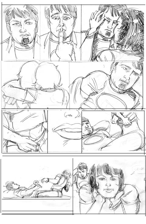
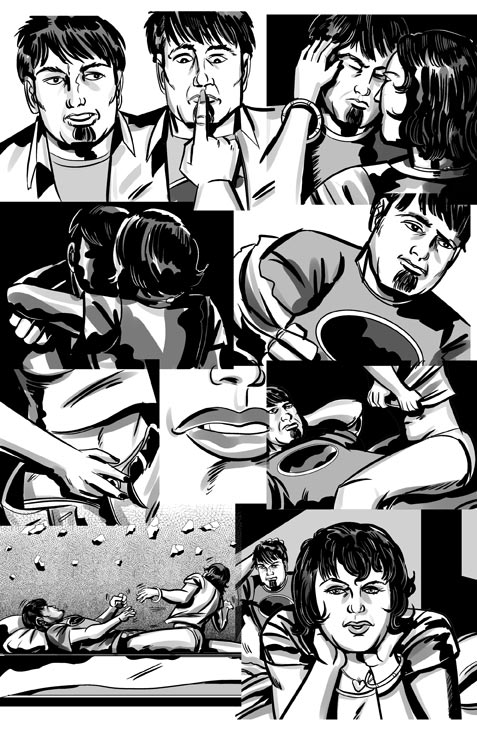
Here's a look at the previous few steps before we go on. Here're the rough pencils, and digital inks (done in Manga Studio) from page 2 of my story "Row Your Boat" (I didn't draw finished pencils for this story, but went directly from roughs to inks).
A few notes
First of all, this isn't a tutorial about how to use Photoshop. It assumes you have some basic knowledge of the program, and can make use of my rather terse descriptions of techniques. If you have any questions, feel free to contact me.
Now, take a look at the inks... see how they're drawn "wider" than the panels they'll eventually fit into? How they're overlapping each other? I did this deliberately, since I'll eventually crop the panels in Photoshop, and this will give me some flexibility regarding panel size and positioning. I don't worry about the overlap since each panel is drawn in Manga Studio. as a separate layer, which I'll bring directly into a Photoshop composition.
It's also worth noting that I'm using Photoshop CS3 for this tutorial, although I believe that CS2 would work as well. There may be alternatives to using Photoshop, but I love the program, and it has lots of neat features that make the work easier, as we'll see.
Set up your document
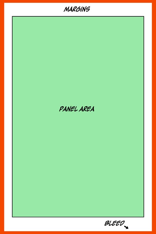
Let's set up the Photoshop document. I usually start with a 10.5 X 7" document (in RGB, I'll talk about dealing with color later...), filled with white. Now, mentally divide the page, allowing about 1/8 of an inch border all around for bleed (the area that will be trimmed in order to have artwork go all the way to the edge of the page). The panels with the artwork will lie in the center of the page, surrounded by a variable margin of whitespace that aids in readability, and allows for the center binding of a comic.
For this story I'm using margins of 3/4 inch on the top and bottom, and slightly over 1/2 inches on each of the sides. Like I said, this is variable, and you can use what you want, but make sure it'll read well when trimmed and bound.
Make your Panels
My next step is to lay out the panel area. I usually start by pulling "guides" from the rulers on the top and side of the document (use menu item-> View:Ruler if they're hidden), using the distances I explained above. Then I make a new layer (using the "layer" palette), name it something logical like "Panels", and then drag a selection rectangle (Marquee Tool) in the shape defined by the guides, and fill this area with white.
Now, here comes one of those "Photoshop-specific" features that's really cool... double click in the center of the layer in the layer palette (or use menu item-> Layer:Layer style:Stroke) and give the layer a stroke of, say... 4 points, and change the color of the stroke to black. Suddenly we have a ruled huge panel in the center of the page. Layer effects are really handy.
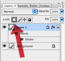
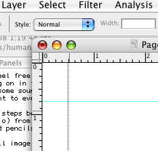
Now we have the general shape of our panel area, but we need to cut this into the individual panel shapes that we need. First, protect the transparency of the panel layer by clicking on the checkerboard button on the Layer palette, shown here. This will let you delete sections from, or add to the shape of the panels without getting any messy fringed edges.
 Next (referring to the rough), use the Marquee tool to select the gap between the first and second row of panels, and hit the delete key. Continue doing this, deleting the horizontal and vertical spaces between panels, until you have a rough layout of the layout of your panels.
Drag your inks over, turn them into Smart Objects, and clip them to the panel layer
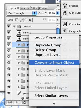
Open the layered Photoshop file of your inks exported from Manga Studio. The way I ink the page, I end up with named layer folders ("Panel 1, Panel 2, Panel 3...") for each panel, with the inked lines, fill shapes, and backgrounds contained within. Then I drag these folders (or you could "duplicate" them) to the page layout document as multiple folders positioned above your "panels" layer.
Here's another cool use of a Photoshop feature. Turn each of the layer folders into a Smart Object. This will make them act like little embedded files in the document that you can resize multiple times without distortion. Select all of your newly created smart objects, and chose "Create Clipping Mask" from the layer palette menu.
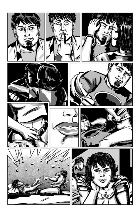
Suddenly, those Smart Objects are clipped by the shape of the panel layer. Now you can select the individual objects, oh heck, let's call them panels, and resize them to better fit, further masking the them (add a mask layer to the Smart Object) if there's any overlap into adjacent panels.
Continue to tweak the shapes of the panels by selecting the panel area with the Marquee Tool, and "Transforming" the selected area to the right size and shape. Use layer masks to make more complex shapes (like panel 9 on this page). If you need more flexibility, you can make each panel a separate layer (with its own layer effect, and clipped Smart Object layer on top. That way you could have different effects on each panel, if that's called for.
I find this an incredibly flexible and powerful way to work, especially if you need to make changes to the layout after you've inked the page.
