How to Make Comics
Part 6 - Digital Lettering and Balloons:
This is the sixth part of a series of tutorials I've been writing about how I make comics. All of these methods work for me, but your mileage may vary. If you haven't already read the last part, Digital layout in Photoshop, what are you waiting for? Go back and read that section now!
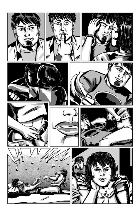
(Click on the small image to see a larger version in a new window)
At this point we've worked our way up from script to roughs, from roughs to pencils, from pencils to inks, and then laid out our inked panels on our page. All along the way the process of making comics is the process of refinement, and now the time has arrived to add type to our page.
A little history
Back in the dark, pre-digital age, all comic books were lettered by hand. Skilled craftsmen laid out lines of type by using an Ames Lettering guide, tediously drafting balloons and dialog boxes, and miraculously producing enormous amounts of beautiful, hand-lettered type.
Don't get me wrong. I really appreciate the work that went into these comics, especially considering that they used to sell for a dime, but I am sooooooo glad that I don't have to go through that process just to meld words with my pictures.
But nowadays...
Here's how I (and a heck of a lot of comics creators) do lettering nowadays. We use a series of digital fonts, available for purchase at a number of places online. Me? I get my fonts from either BlamBot or ComicCraft. What you generally need, to start, are a few dialog fonts, and maybe one or two sound effects fonts. I use either Zap Raygun or CC Meanwhile for dialog, and CC BiffBamBoom or BadaBoom for effects.
There are also a number of free fonts out there, but make sure that you don't violate anyone's rights, or steal intellectual property by using commercial fonts acquired from a pirate website. Respect those craftsmen and pay a little. In the name of god, just don't use some awful font like Comic Sans, unless you're trying to be laughed at.
My method
Here's where I depart from the party line when it comes to digital lettering. Most everyone will tell you at this point to open up Adobe Illustrator, and patiently explain to you how that program deals with vector art, while Photoshop deals with pixels, and how Illustrator is resolution independent, and blah, blah, blah.
All true, but do you know what? Those same tools are also found in Photoshop. Photoshop allows you to set type, make word balloons (yes, resolution independent, with adjustable tails and everything), and letter dialog, and it's all in the same place you lay out the page. I've got nothing against Illustrator, but I find it makes much more sense to do it all in one program.
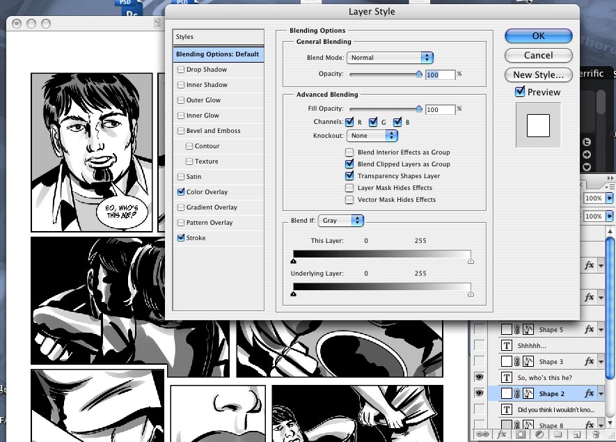
It all comes down to a much underused feature in Photoshop; the Shape Layer. A Shape Layer in photoshop is a vector shape on which you can apply any number of layer effects (things like glows, fills, strokes, gradients, etc). As you resize the shape layer, it rasterises the layer (that is, turns vectors into pixels) at the new size with no degradation. Pretty cool, eh?
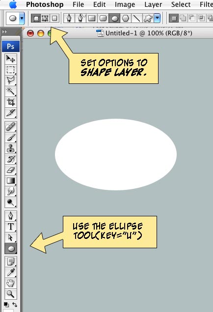
Here's how to start. Open up your layered Photoshop document that contains your artwork and in the Layer Palette, make a new Layer Folder called, uh, I dunno... howabout "text." This will allow you to turn the text on or off while you work, or even create different versions for different languages.
Fun with balloons
Let's illustrate this by creating a word balloon. Using the Ellipse Tool, and setting the options on the toolbar to use Shape Layers (as opposed to creating paths, or drawing with pixels), draw out your balloon. Don't worry about the color, or even the shape. You can change that later. Now double-click on the layer in the layer palette (or use the menu item Layer: Layer Style:Stroke. This brings up a dialog box where you can change the fill, strokes, drop shadow, glow, blending mode, or whatever for that layer. So make the layer filled with white, and make the stroke a 4 pixel line. Voilà!
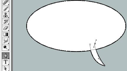
So you want a tail? Easy. Take the pen tool, set the toolbar option to "add to shape area" (or even easier, hold down the plus key) and you're adding the tail to the ellipse. You can just use 3 points to make a sharp tail, or drag points to make curved ones.
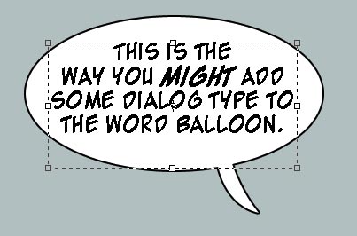
Adding type just involves using Photoshop's type tool. Drag out a rectangular shape with the tool just larger than your ellipse. Type in your dialog, being sure to space the type so that short lines are at the top and bottom of the ellipse shape. Tweak the shape of the balloon, move the point of the tail, and bold the words that you want to emphasize. Go crazy! You can reshape and resize the balloon and type to your heart's content.
This same technique can be used for narration, dialog, credits, basically anywhere you need type in your comic.
